Ever notice how the food you buy from McDonald’s tends to look a bit well, underwhelming, compared to the giant-sized photographs of their burgers they use on their menus? If so, rest assured your curiosity doesn’t stand alone. A Canadian woman emailed the fast food giants to ask them the exact same question. McDonald’s graciously responded with a 3 1/2-minute video clip explaining why, as they take us on a behind-the-scenes tour of a Quarter Pounder photo shoot (and it has received 10 million views). See it here:
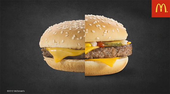
The side-by-side comparison of the burger purchased from the store and the burger made in the studio makes us wish that McDonald’s would put that much effort into making all their burgers look so large and delicious.

Restaurant Burger vs Photography Studio Designed Burger
It seems that what McDonald’s is basically trying to tell us is that they aren’t attempting to deceive their customers; in fact, they’re saying it’s just the opposite. The point of going through all the troubles they take to create these arguably unrealistic food photographs is to show customers exactly what ingredients they will be served with their meal.
Like This Article?
Don't Miss The Next One!
Join over 100,000 photographers of all experience levels who receive our free photography tips and articles to stay current:


Thanks for sharing valuable interview about food photography. hope it will very helpfully not only customer but also food business owner
I ordered a cheeseburger as the one on the photo looked so appetizing, but what I received was approx. half the size with no cheese or gherkin visible. When I took it back and queried the store manager why it is not like the one in the photo, she just threw it in the bin and asked the staff to make another.
The second hamburger was identical to the first, so hamburgers on advertising display are not available, for the reasons shown in the video.
Disgusting junk food no matter how you photograph it.
I’ve seen other video’s on food photography and another trick that I’ve seen is the use of a torch to brown or char meat. Also using a paint brush and cooking oil to “paint” on meat to make it look juicier. Also a sprayer to mist certain types of food so they will have little water droplets on them.
Pretty impressive video. This video confirming that the photography is not the only solution to look good your products on the media. There is a lot more effort we (image processing/editing industry) did to present your product more precisely to your client. Hats off the customer feedback of MacDonald. If they didn’t do that a lot of people might get in dark about the process beneath it.
Some super useful styling tools at play there too. Definitely going to try those out with my fast food client this week!
I agree with Wayne Turner. Very nice of them to show the process.
Interesting to see that they were quite transparent with the process and actually compared their own over the counter burger with the food styled example. They didn’t try to hide anything. Quite impressed with McDonalds although I still won’t eat one:-)
That is really interesting! I thought that some of the food was actually fake (eg plastic).
It always used to annoy me that my burger looked different to the one in the photo until I went abroad and they don’t bother with any of this they just take a photo ( like the left one) in restaurants and it looks so unappetising!
Great video :)
This was pretty cool. I already knew the bit about moving the pickles and onions to the front but loved the detail of the ketchup and mustard syringes. Very interesting. Plus the meat in both photos is approx the same!
Really good little clip of the insight into product photography. As described in the video the whole purpose of the shoot is to make the product stand out and look its very best. This can be said for all types of photography. I really don’t think people appreciate exactly how much of our digital media is enhanced and made to look its very best to make it more appealing. Human beings respond to BIG bright colourful images and this is what sells products.
Really great video