One of the questions that is most commonly asked when shooting in a small home studio is, “Should I use a softbox or an umbrella?” In this video, photographer Gavin Hoey explains the effects of both and delves deeper into how to use a softbox. He then shows us how to take softbox-lit photos and turn them into stunning retro-style images in Photoshop:
Umbrellas vs. Softboxes
Softboxes and umbrellas both have their uses, it just depends on what kind of lighting you’re going for. With a shoot-through umbrella, you get beautiful soft lighting. A reflective umbrella gives you much more control over the lighting and gives it more direction. A softbox gives you both, if you use it correctly.
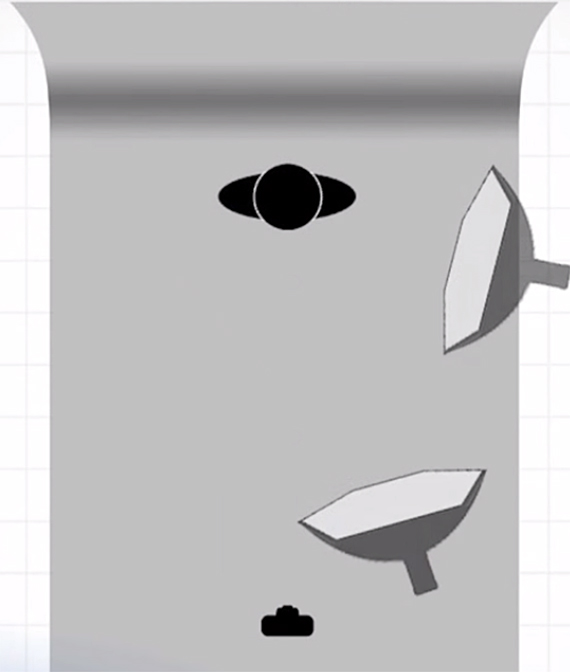
Hoey shows us how to control light and shadows that come with shooting in a small home studio. First, he sets up the shoot with one softbox, which will give the light direction while still providing a soft glow. He uses the Westcott Apollo Orb Softbox with a Flashpoint Streaklight 360 inside. The bare bulb light provides soft but dramatic lighting.
Lighting with One Softbox
- You can change the direction of the lighting with a softbox, so try placing it in different spots around your subject to find the best angle.
- Set your target aperture (Hoey goes for f/11 to get his desired depth of field) and keep that aperture for every shot as you move the softbox around.
- Take test shots as you move the softbox around.
- If the test picture comes out with a strong contrast or harsh, uneven lighting on the subject, move the softbox so the light is not at an angle, but almost directly in front of your subject.
- If it comes out too flat, give the lighting more of an angle.

Move the softbox around to see how the angle affects the lighting.
For Hoey’s photoshoot, he has a final image in mind of a vintage portrait. The nearly straight angle of the lighting creates kind of a flat image, lacking the drama that a sharp angle provides. He wants something in between so he moves the softbox somewhere in the middle, which gives a nice amount of contrast and a little bit of shadow behind his model.
Post-Processing for a Retro Look
Taking his RAW file into Photoshop CC, Hoey makes a few small adjustments to give the photo a feeling of age and create a cool vintage style portrait. The photo already has a nice, warm background color, and the model has a retro style, so the post-processing will just add to that feeling.
- First, Hoey brings down the clarity to -30 to create a dreamy softness.
- To add to that glowing effect, he adjusts highlights and brightness. He increases the exposure by about half a stop and brightens the highlights and whites to get sort of a burnt out effect that works for the retro feeling.
- Since there was only one light in the studio, there were more shadows; to deal with this, Hoey increases the shadow slider to brighten them up slightly.
- He takes the warm tone of the existing image even further and adds a nice creamy feel by increasing the temperature.
- To enhance that, he decreases the vibrance.
Because he only used a single, smaller softbox, Hoey also needs to fix the uneven lighting that left the model’s legs darker than her face. To do this, he zooms in on the legs and makes a few adjustments:
- Increase the exposure with the adjustment brush.
- Bring up the shadows to open them up.
- Pull down the saturation.
- Turn on Auto Mask so he can brush outside the legs without ruining the image.
- To fix the speckling effect of Auto Mask, turn off Auto Mask and, using a small, hard brush, erase the images around the legs to bring it back to the original.

Before/After
And there you have it, a beautiful final image with a retro feel.
Like This Article?
Don't Miss The Next One!
Join over 100,000 photographers of all experience levels who receive our free photography tips and articles to stay current:


Leave a Reply