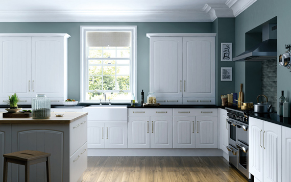
With any good photography, you need to decide beforehand what the purpose is of the image that you are about to make. Is the picture intended to show the interior design, the build, the finish, the furniture, or perhaps the floor or ceiling? Perhaps the lighting company hired you to cover its latest project? Try to look with the eyes of your clients and see what they want to communicate with the pictures. It makes a tremendous difference if you photograph with a wide-angle lens from a high viewpoint to give an overview of a space or from a low viewpoint to draw the attention to the furniture or the ceiling.
In this article, we will discuss the steps and photographic techniques you may consider to make the most stunning interior photographs.
1. Camera position
When photographing an interior, do you view the space through the eyes of the visitor of a space or the designer? A designer may want you to give an overview of the interior to enable him or her to explain the layout of the place. The camera standpoint will be much higher than that of a visitor. For good coverage, you may want to do both.
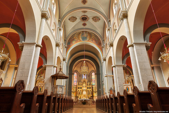
When positioning the camera, use a sturdy tripod with good leveling possibilities. You will find that the so-called ‘ball-head’ tripods used for flexible positioning are far from ideal for this type of work. It’s better to use a tripod head where you can adjust every dimension independently. The built-in leveling device will give you a good starting point. Look for walking patterns and view lines in the interior. Make sure that the vertical lines remain vertical, in a way that walls don’t fall and furniture doesn’t look pear shaped. Realize that when transforming a three-dimensional space into a flat, two-dimensional image, the picture needs to be pleasing to the eye. So look for classic diagonal view lines, and try to implement the rule of thirds.
Subsequently, look for horizontal lines in relation to the frame of the picture. If the horizontal lines are level with the picture frame, that’s perfect. Don’t forget that any correction of vertical and horizontal perspective in post-processing will eat into the overall resolution of your image. The use of wide-angle, tilt-shift lenses will make life easier and give you more flexibility in choosing your position. Also, live view (attached to a laptop or tablet computer) is a very necessary feature of your camera with this type of photography. In the olden days, analogue photographers took these images with large, bulky technical view cameras and had to judge the ‘preview’ upside down, covered with a black sheet.
2. Exposure and contrast
The wide-angle lens and tripod allow for great depth of focus by using small apertures. For a 17-24mm lens on a full-frame camera, use f/8 – f/16 for the sharpest images at ISO 50-200. Use a remote control or the timer to avoid any camera shake.
You will find huge differences between the lighter and darker areas of an interior, especially when bright daylight is coming in. If you use the center-weighted average or evaluative exposure mode of the camera, the white walls and ceilings will look dull and grey, and the shadowy areas will lose detail and color. A simple way to overcome this is to overexpose the image and darken certain areas in post-processing by way of dodging and burning. The success rate depends on the contrast, exposure, and the dynamic range of your sensor. It’s best to use a combination of analogue techniques and digital contrast enhancement in post-processing.
By adding light to the darker areas, the overall contrast will decrease, and color and clarity will return in the shadowy areas. Obviously, this needs to be done in a subtle way so that the natural atmosphere of the space is not changed.
Another way is combining multiple exposures in Photoshop. Do this by adjusting the exposure time and taking 3-6 exposures, depending of the overall contrast. Make sure that the camera doesn’t change position during the exposures and that there are no moving subjects in the image. There are various automated ‘HDR’ type software methods to combine these images automatically, but I find that the end result tends to look very artificial. I use a manual method called DRI, or Dynamic Range Increase, in Photoshop. I start with the one or two stops overexposed image and then put the darker ones in layers over each other by selecting the highlights and masking them. This will take a bit of practice, but you will get very natural results!
Obviously, in some situations you can combine the two above described methods.
3. Color temperature differences
An interior usually has a wide variety of light sources. Fluorescent will generate a greenish image, whereas tungsten will make the surrounding area of the light source brownish-red. Incoming daylight contains a lot of blue, as does the flash. It is crucial that you adjust the white balance of your camera as accurately as possible using live view and some careful interpretation; it is impossible to remember how it was when you are sitting behind your monitor.
Usually, the color balance will lean towards tungsten, and the camera should be set somewhere in the region of 3000 to 4000 Kelvin. Some partial editing will be needed in certain areas to bring these within an acceptable level. Usually, the blue effect of daylight is accepted—and very much liked—in the interiors industry because of the high-tech stage light effect.
I hope this gives you some guidance in the right steps to take to improve your interior photography. Practice a lot, and you will find your way!
About the Author:
Vincent Hartman (http://www.studiovhf.com/en/english/) is an advertising and commercial photographer in The Netherlands and photographs interiors throughout the country for architects, designers, and design-and build-companies.
Like This Article?
Don't Miss The Next One!
Join over 100,000 photographers of all experience levels who receive our free photography tips and articles to stay current:



Leave a Reply