Color can be a dominant element in photography, but not always for the better. If you use color sloppily, just because it’s there, you have missed its real power. Back in the days of black and white, every image had to stand on its own merits. A red rose, for example, was not automatically thought of as a passionate shot, because there was no color involved. You had to stop and think, “What makes a rose passionate?” You had to use all the elements and principles of design to make a shot work. Technically, you still do. But when color enters into the equation, it’s very easy to let it do all the work for you.
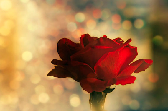
Photo by Carol Von Canon; ISO 800, f/4.0, 1/400-second exposure.
We’ve all heard things like: “Wow, that’s a great red sunset.” Or, “I love that cool blue in your waterfall.” The question still remains — would they have liked your shot if there was no color in it? Don’t get me wrong; I’m all for color, but I consider it a great supporting actor, not the star of the show. If the only thing you can state about a particular shot is that you love the colors, then you are guilty of being sloppy with color.
That having been said, far and away the most powerful force of color is its emotional impact. In a novel by Irving Stone called “The Origin,” Charles Darwin says, “Green is the most restful and satisfying of all colors.” In that same novel, Dr. Adam Sedwick replies, “You’re right; green is the color to unravel the knots of life’s rope. Blue is colder, red more explosive, yellow turbulent . . .”
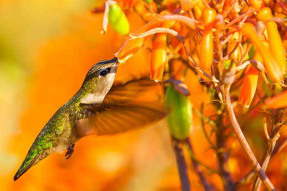
Photo by Danny Perez Photography; ISO 200, f/5.6, 1/500-second exposure.
The first mistake that most photographers make when working with color is to assume that it is the most important factor — even to the exclusion of basic composition. I’m sorry, my friend, but that is wrong. Regardless of how vivid or exciting a color is, that in and of itself does not mean it will be a great photograph.
Ideally, a photograph should have one dominant color. Additional colors should appear subordinate to and supportive of the main color. Remember that different colors evoke different emotions. Some are positive, some are negative, depending on the viewer’s perspective. If you want to send a clear message in you image, you should strongly consider a dominant color.
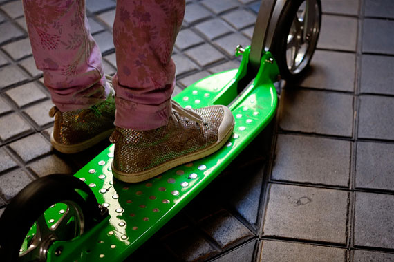
Photo by Max Sat; ISO 800, f/2.4, 1/90-second exposure.
As we have already mentioned, red is often associated with passion and romance. But keep in mind that it can also bring up thoughts of pain and anger. If you want to tap into the subconscious mind of your viewer, then you need to be aware of many of the associations that people have with color.

Photo by Ben Pugh; ISO 400, f/4.0, 1/1700-second exposure.
For example, in the United States, the color white is often associated with weddings. A bright, colorful cheerful event, right? In Korea, white is worn at funerals. That color is associated with death. If you are a M*A*S*H fan, you will remember this lesson when Max Klinger offered his Korean bride-to-be a beautiful white wedding dress. He didn’t exactly get the response he was expecting.
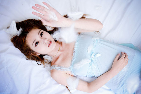
Photo by Greg Tsai; ISO 100, f/4.0, 1/50-second exposure.
Here is a partial list of some of the things that we often associate with different colors. Remember to keep cultural and family history in mind:
- Red = passion and romance or violence and anger
- Yellow = joy and intelligence or criticism and fear
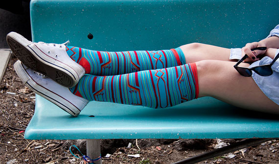
Photo by Chris Goldberg; ISO 200, f/5.0, 1/500-second exposure.
- Blue = peace and harmony or fear and depression
- Orange = confidence and energy or slowness and pain (fire)
- Purple = royalty and religion or bruised and beaten
- Green = growth and soothing or envy and greed
- Black = strong and committed or evil and death
- White = purity and goodness or cold and distant
A photograph that has a dominant color has a greater chance of sticking in the viewer’s memory—if it was taken correctly to begin with. In other words, having a dominant color will not make up for poor composition. But if you already have a winner—good composition, good lines, rule of thirds, framing, etc.—then the dominant color becomes the icing on the cake. If someone walks away from your image with a strong emotional experience (good or bad), you can consider yourself a success.
Now it’s time to go out and do it again, and again, and again . . . keep on smiling!
About the Author:
Award winning writer / photographer Tedric Garrison has 30 years experience in photography (better-photo-tips.blogspot.com). As a Graphic Art Major, he has a unique perspective. His photo eBook “Your Creative Edge” proves creativity can be taught. Today, he shares his wealth of knowledge with the world through his website.
Like This Article?
Don't Miss The Next One!
Join over 100,000 photographers of all experience levels who receive our free photography tips and articles to stay current:


Love this blog post! I do really believe when we shoot we need to think about what color is perfect for the location and the mood as well. So basically, for wedding, engagement better to use yellow or red for the toning or the clothes?
Awesome post! What about complimentary or triad colours? Do they create even stronger connections? I think it’s best to have one strong color and is complimentary color maybe less prominent by being less saturated and just overall less ‘in-your-face’.