Want to spice up your location portraits? This tutorial from Adorama instructor Gavin Hoey takes us through a simple setup, shoot, and post-processing session that will get your creative juices flowing. Take a look:
Great location portraits generally need just three things: a good model, a beautiful location, and a proficient photographer. But that doesn’t mean they’ll catch the viewer’s attention. Adding a bit of creativity–stylization, in this case–can be just what the doctor ordered if you’re wanting to spice up your work and set yourself apart from the crowd.
What is a Stylized Portrait?
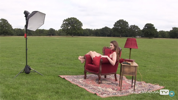
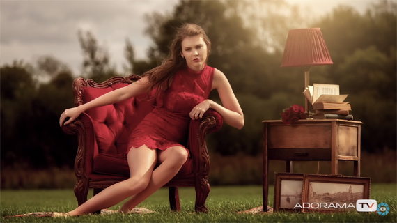
Stylized portraits are those that don’t realistically represent the physical world. In other words, they add a bit of interpretation and creative flair. In Hoey’s case, he takes a theme–bringing the inside outside–and uses it to create a momentary world that would normally not exist. On her own in this location, the shots would likely seem a bit ordinary. Adding a theme and a few unusual set pieces and props gives a whole new dimension to the shoot.
Lighting
The lighting, in this case, is pretty simple–a Glow HexaPop 24″ Portable Softbox with a Flashpoint Xplor600 Flash. It would have been cool if he had also used an LED in the lamp, but it’s still a pretty interesting scene without it.
Post-Processing
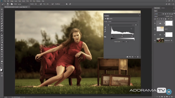
Hoey’s post-processing is also quite simple and took maybe five minutes. He added a bit of warmth via the color balance adjustment panel, created a quick sun effect with the paintbrush, and then added contrast via the levels panel. From what I can see, he didn’t even adjust the clarity (in Lightroom).
While stylized portraits don’t always need to have a theme, themes do help. Can you think of any that are as strong, yet as easily executable as this one?
Like This Article?
Don't Miss The Next One!
Join over 100,000 photographers of all experience levels who receive our free photography tips and articles to stay current:



Leave a Reply