This article is based on concepts from The Photography Action Cards if you want to dig deeper for further training.
Color contrast is a relatively straightforward tool of composition to master. Once you start looking for it, you will see it almost everywhere. This is especially true in nature, which has evolved to use color contrast for camouflage, reproduction and other essential activities that require the attention of some living being.
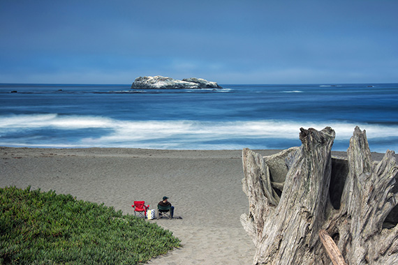
Cannon Beach, Oregon. (Photo by Kent DuFault)
This photo creates a composition roadmap right toward the subject, due to the color contrast. Imagine if the chair had been green or blue—it would not have had the same visual effect.
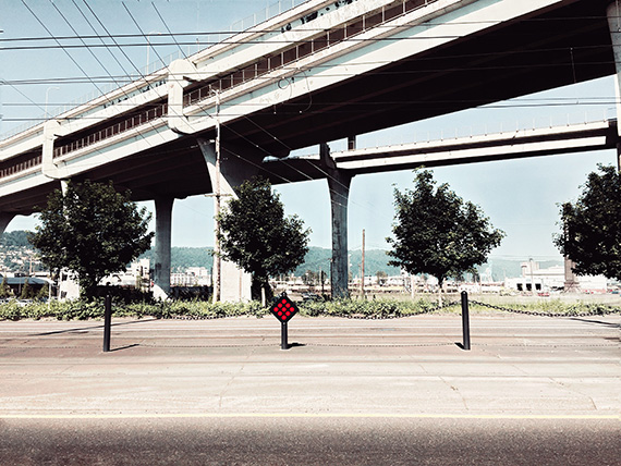
Road Sign, Portland, Oregon. (Photo by Kent DuFault)
To better define color contrast, let’s first discuss what isn’t color contrast.
- Color contrast has nothing to do with light to dark—that’s tonal contrast.
- Color contrast has little to do with saturation—saturation is a defined amount of brilliance and intensity for a particular color.
Two Pro Tips
- White and black are the only two colors that create a color contrast with all other colors.
- Changing the terminology from color contrast to contrasting color can help you remember this composition tool.
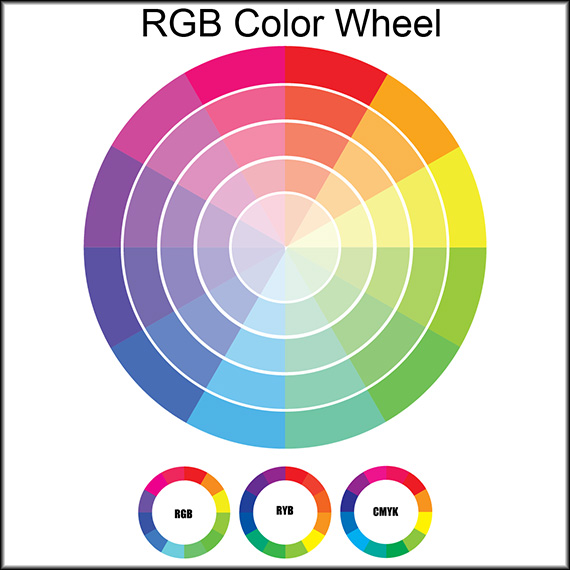
Graphic by Kent DuFault
The two most common color wheels used by photographers are the RGB wheel and the RYB color wheel. It’s important to understand this, as any information regarding contrasting colors can become confusing if you don’t realize that there is more than one wheel out there!
Here are the photography skill points discussed in this article:
- We will learn about the different color wheels.
- We will discuss identifying color contrast (contrasting colors).
- We will look at several case studies using color contrast and decide for ourselves what worked and what didn’t.
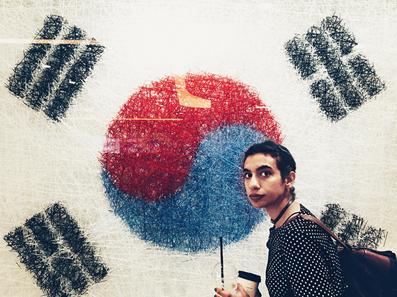
The colors and shapes of the South Korean flag are pictured here behind this young woman. (Photo by Kent DuFault)
Contrasting color is such a powerful visual tool that it’s used in everything around us. This fact is why you want to be using it in your photography.
Red and blue are contrasting colors—but on which color wheel? Earlier, we learned that white and black contrast every other color.
It appears the designers of the South Korean flag were most certainly making use of color contrast. They used the CMYK color wheel. That’s one that we don’t often see as photographers.
Why did they use the CMYK color wheel?
The CMYK color wheel is for use with any project that is to be printed using a traditional ink printing press.
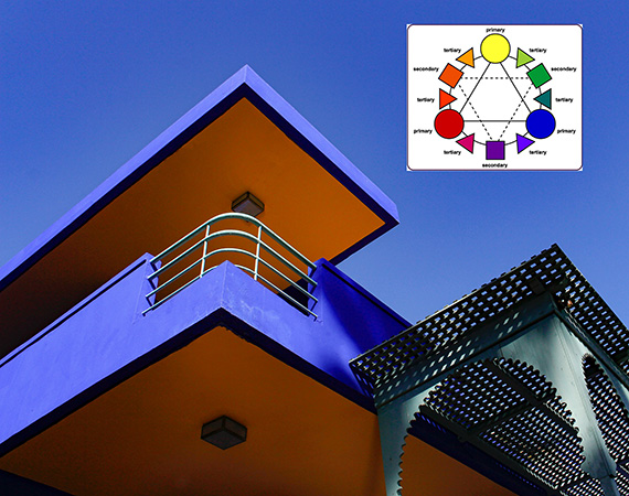
Original image by Tamara Budai
In the architectural photograph above, you can see how the photographer utilized color contrast to guide the eyes toward her subject area: the railing.
Isn’t it interesting how the railing in the above photo is almost white, which contrasts all the other surrounding colors? That fact cements the railing as the subject area within the composition.
Pro Tip: A color directly opposite another color on a color wheel is the complementary color. A complementary color combination is the ultimate level of color contrast; it doesn’t get any more contrasting than that. However, colors adjacent to those colors on the wheel also create color contrast. There are different titles for those adjacent colors: secondary and tertiary.
Try This: When you explore contrasting colors in your photographs, you are likely creating a “color scheme.” There are standardized color schemes that you can use in your photography.
Five color schemes work well to create contrasting colors in photography. They are primary, secondary, complementary, square and split complementary.
Analogous color also is used in photography. Do you know the tool of composition that it creates? I’ll tell you at the end of the article.
Hue, Tint, Tone and Shade
Understanding these four concepts will also be helpful in working with contrasting colors.
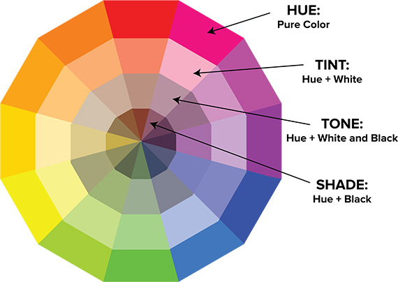
Graphic by Nuyulondon
- Hue refers to the origin of the original color that we see. For example, a hue could be red. This title of “hue” means it is a pure red—no other colors are influencing the red.
- Tint is a hue with white added to it. It takes the original color and lightens it.
- Tone is a hue with gray added to it—equal parts white and black. It alters the brilliance of the original color.
- Shade is a hue with black added to it. It takes the origin color and darkens it.
Compilation by Kent DuFault
Understanding color contrast is one of the single most important skills you will develop as a color photographer.
It is used in virtually everything around us, from product packaging and automotive design to the paint you see on your home’s walls.
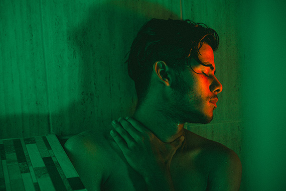
Photo by Fernando Cabral
Getting Started
Study the color wheels in this article. Write down some color combinations that appeal to you.
I want you to try two different photo projects. For the first one, I want you to create a photograph by choosing objects that present the color combinations that you chose. Let’s say you chose red and green. How about dressing a model in green and placing them in front of a red wall?
Secondly, I want you to take an afternoon photo walk. Look for your chosen color combinations. This one might take some time. You might also see other contrasting colors that catch your eye; by all means, take the photo! Be playful and experiment.
The concept of contrasting colors can be broken down into two basic categories, for those that don’t want to explore it in any greater depth. Those categories are warm and cool colors.
Including colors from both sides of the spectrum will always create color contrast in your photo.
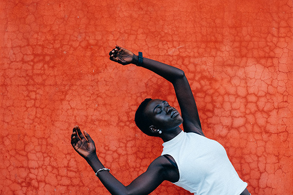
Key Learning Point: The word “contrast” is defined as the state of being strikingly different from something else, typically something in juxtaposition or close association.
In the above picture, the wall creates a striking color contrast to the model. It is the contrast that envelopes her and forces the eyes to her.
Case Studies
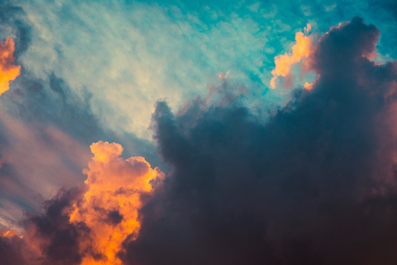
This combination above, of contrasting orange and teal, is arguably the most widely used and recognized color contrast in photography. When this combination of colors presents itself, you can’t go wrong.
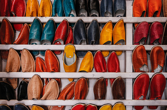
Photo by Martin Adams
The photo above doesn’t make great use of contrasting orange and teal, even though those colors are present.
Why is this?
Pro Tip: Contrasting colors often work best when they are in some form of isolation. Go back over the photos in this article and note how the color contrast is isolated in some way. It draws the eyes toward a particular point within each picture.
The color contrast within the shoe photo is too prevalent and too evenly distributed across the composition to be genuinely useful.
The photographer even flipped one shoe to create a focal point. However, the color contrast is so dense and visually overwhelming, you can barely notice it.
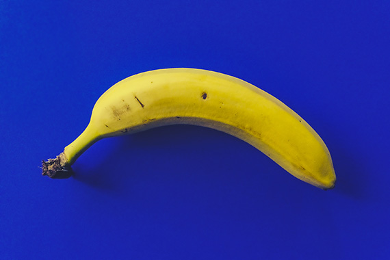
Photo by Daria Nepriakhina
When using color contrast, a faithful companion tool is negative space. Yellow and blue are complementary colors on the RGB color wheel. This fact gives the banana photo the highest level of color contrast possible. That, in turn, moves the field of blue into becoming negative space for the subject, which is the banana.

Photo by Joshua Sukoff
Close your eyes. Count ten seconds, and then open them with this photograph in front of you. Where do your eyes travel to immediately?
They go to the gondola car. That is a forced reaction of the mind. You can grab a viewer’s perception and completely control it for the time when they look at your photo.
This brings up a critical point.
The color contrast in the banana photo works. But after that, there is little to hold a viewer’s attention.
In the gondola picture, there are six elements of composition at work versus only two in the banana photograph. They are:
- Color contrast, of course
- The rocks in the foreground are a frame
- The guide wires on the gondola are leading lines
- The man in the window is a focal point
- The man’s hand sticking out from the window is a point of movement
- The man’s face was looking down at the camera, which is a line of sight
Pro Tip: All photo composition becomes more potent when you combine multiple elements and tools. I always recommend at least three aspects of composition be included in a photo to make it effective.
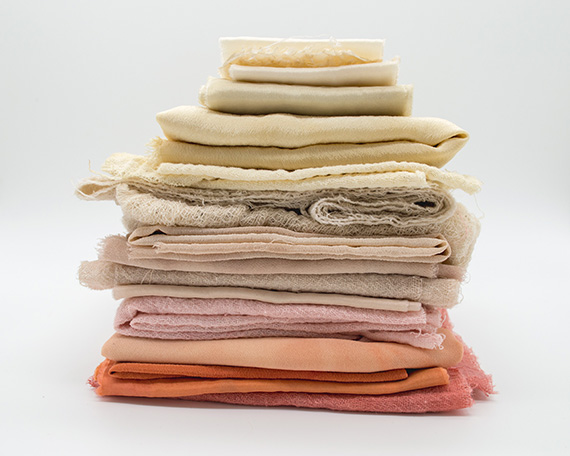
Photo by Mel Poole
Is a photo with low color contrast a bad thing? Not necessarily. Much depends upon your message and your composition as a whole.
Low color contrast is often associated with things that are considered natural, healthy and wholesome. The photo of the fabrics above has low color contrast.
Can you tell me how to identify if a scene has low color contrast?
I’ll let you know at the end of the article.
Color Contrast Variables
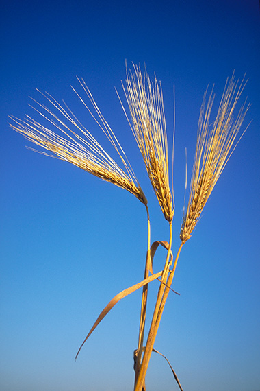
Photo by Kent DuFault
Is this photograph of the stalk of wheat using color contrast? Or is it simply using tonal contrast? Think about it.
Let’s look at a color wheel.
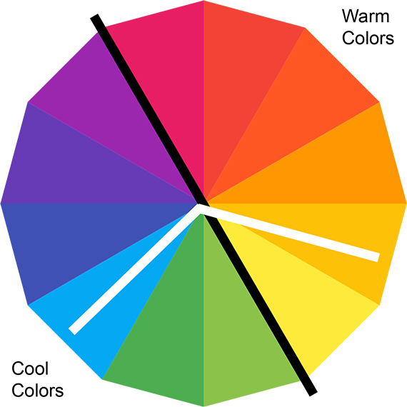
Graphic from Pikpng
In the graphic above, the white bars represent the two primary colors in the stalk of wheat photo.
Are they contrasting colors?
Pro Tip: Remember, colors do not have to be complementary to be contrasting. The colors in the wheat picture are contrasting. One of the colors comes from the cool side of the wheel, and the other color comes from the warm side.
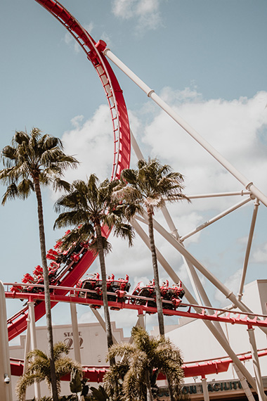
Photo by Briana Tozour
Pro Tip: Colors do not have to be highly saturated to be contrasting with each other. Highly saturated colors will often create one mood, while less saturated colors, such as in the photo above, will create a different atmosphere. I often photograph a color contrast scene as I see it with my eyes, and then, in post-production, I decide which mood best fits the picture.
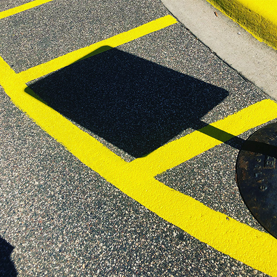
Sign and line. (Photo by Kent DuFault)
Does this shot create a color contrast? Or does it rely on the highly saturated yellow color for interest?
It does create a color contrast.
Important Point: Let me repeat this. Black and white create contrast with any other color.
Without the black areas in the above photo, it would become quite dull.
Answering a Question From this Article
Q: What are colors that lie adjacent to each other called, and how are they used in photography?
A: Adjacent colors are called “analogous colors.” In photography, they create what is known as a monochromatic color photo.

Ramona. (Photo by Kent DuFault)
This image is an example of a monochromatic photo—where the vast majority of the colors present in the composition would fall close together on a color wheel.
The best way to identify if a scene has low or high color contrast is to study the color wheels, especially the RGB and RYB color wheels. I have both of these color wheels printed out and I carry them in my camera bag. At times, they have come in handy when I’m trying to select a camera position.
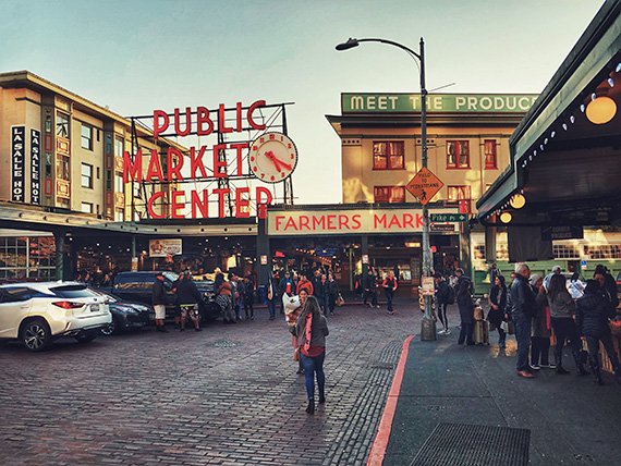
Pike Place Market, Seattle, Washington. (Photo by Kent DuFault)
Does this scene have contrasting colors? Maybe we should whip out our printed color wheels and decide for ourselves!
Conclusion
- The colors white and black are the only two colors that create a contrast with all the other colors.
- Changing the terminology from color contrast to contrasting color can help you to remember this composition tool and how it works.
- The two most important color wheels that are used by photographers are RGB and RYB. The CMYK wheel is primarily for use with a printing press.
- Color schemes work well for helping a photographer work with contrasting colors.
- Combining a warm and cool color within the same picture creates color contrast.
- In photography, you can’t go wrong when combining red or orange with teal.
- Color contrast works best when it has some form of isolation from the rest of the composition.
- Negative space is a helpful companion to contrasting colors.
- Most photos need multiple tools of composition to be effective. I recommend at least three.
About the Author:
Kent DuFault is an author and photographer with over 35 years of experience. He’s currently the director of content at the online photography school, Photzy.com.
For Further Training, Deal Ending Soon:
65 beautifully designed & printable Photography Action Cards are now available that will give you over 200 photography assignments, covering everything you can imagine. They are currently 88% off today if you want to try them out.
These Action Cards discuss a photographic topic, provide you with suggested considerations, and give you specific photographic assignments. They’ll kick you out of the “nest” to go have a personal discovery experience all on your own.
Found here: The Photography Action Cards at 88% Off
Like This Article?
Don't Miss The Next One!
Join over 100,000 photographers of all experience levels who receive our free photography tips and articles to stay current:



Great article. Colors and contrasts are two key elements in street photography as well!