Today’s case study on an award-winning landscape photo was kindly shared with us by Ignacio Palacios, author of the 10 Ingredients of Composition Mastery which is designed to help photographers of all skill levels master photography composition.
How ‘Confront’ became ‘Heartbroken’…
If I’m honest with myself, and courageous enough to say it, I feel that ‘Heartbroken’ is one of the best images that I have created so far in my career. I am very close to this image emotionally, which no doubt impacts my judgement from an outward perspective, but it is a very special image to me for what it represents and as an image it has had quite an evolution – which I will now share with you.
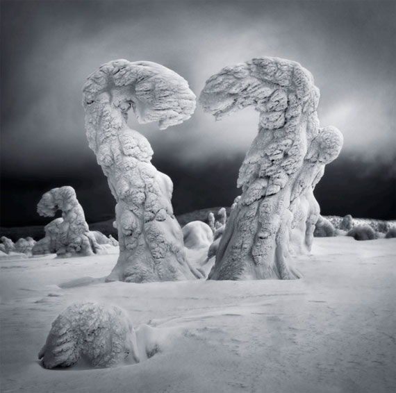
Heartbroken Lapland, Finland
I will begin with the story behind its original form ‘Confront’ and continue with its development into its final form renamed… ‘Heartbroken’
‘Confront’
I was running a photography workshop in Lapland (Finland) and I was looking forward to photographing the infamous “frozen trees” in the Riisitunturi National Park. It had been a great year with lots of snow and the landscape and conditions were absolutely pristine. I have never seen anything like it! It felt almost like being on another planet with both the atmosphere and shapes amongst the trees. There was also a minimum temperature of -28 C while we were there, which was an experience in itself!
During the first day of the tour, I came across these two frozen trees which almost immediately spoke to me on a much deeper and more personal level for what they represented. I instantly saw
and felt two distinct figures, both angry and in real confrontation with one another. During that trip I was having some issues with my ex-partner and I couldn’t help but project those feelings
(a very challenging experience in my life) into what I saw.
The last couple of years before I captured this image had not been easy. I had parted ways with my wife, and I had also struggled to move forward into new relationships. This image in many ways, came together to symbolise the personal struggle and challenge I had been moving through.
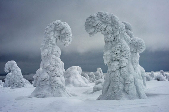
‘Confront’: Finalist at the Head On (Landscape) prize 2018.
Confront was sent to the Head On Awards directly from Finland while I was running the trip and I was selected as a finalist in the Landscape Category. I was happy for the acknowledgment, but I knew that I had done minimal work on the image and couldn’t shake off the feeling that I still had further to travel with it… Just as I felt I still had a way to go with the personal journey I was on in my life.
And travel with it I did… both personally and professionally.
And so, comes the story of how ‘Heartbroken’, the next evolution of the image was created…
‘Heartbroken’
It was a Sunday and I decided to sit down and process to relax and forget, a ritual that often works to take my mind off things. I was struggling, feeling very depressed and having a really tough time with issues relating to my past relationship.
I found myself gravitating back to this image and began to channel all that energy and feeling into my post-production – and out of that tough Sunday afternoon session – ‘Heartbroken’ was
born. I will always remember that Sunday, it still remains as one of the hardest days of my life…
I have read that there is a link between depression and creativity. I don’t know if that’s true, but in the challenging state I was in, I just kept working at it for hours and hours. I couldn’t
leave my seat. I just wanted to pour all my feelings into this image and express what I was going through in a visual way.
Any engaged human activity is impacted and influenced by your emotional state and editing is no exception to this. That Sunday, I channelled my pain, took resolve from it and then used it to full effect in pushing my creative boundaries and refining my vision.
The first intention of ‘Heartbroken’ was of course, to symbolize a heart. As you can see the heart is not complete, it is broken. The two trees and the two sides of its shape barely touch each other. There are many ways you could interpret this image and what you see into it. The story that I wanted to tell with this image, was that most difficult relationships can’t be resolved. If there is
love, you can reach out to each other and try to repair it. But sometimes, it is not possible. When love is broken, maybe it can’t be mended, and that is what this image represents for me.
A few significant changes were made to the image in transition from ‘Confront’ to ‘Heartbroken’ in parallel to the internal emotional journey I was on. Let’s shift back into a more educational mode again and explore the more literal and interpretive changes from the original to the newly created version…
Composition and Structure
The added area of foreground and the extra space at the base of the image gives you more of a lead into the hero elements of the two trees and adds considerably to the overall depth and sense of visual perspective. It provides some extra breathing room around the central structures, to explore and reflect on their symbolism and meaning. It offers a grounding point at the base of the image and brings in a touch more complexity and sophistication to the composition without being too distracting. It also provides a slight rest for the eyes before launching into the main subject.
The two central trees were reshaped using a number of tools in Photoshop, mainly warping, to great effect. They were given a similar shape and size to match each other in their physicality and mass. They were also reshaped to create the heart-like profile when combined and viewed side by side. This creates a central element of symmetry in the image as well.
The shift to a square crop adds a slightly different dimensional quality to the image as a whole and helps somewhat to give centre stage, containing the image and increasing focus on the two main
trees.
The alignment of the main features with the Rule of Thirds, both vertically and horizontally, gives the image significant visual balance.
There is a deliberate gap between the two of them which helps maintain a found believability, but the gap is close enough that you can almost feel the yearning for the two to join… an invisible
bond almost, and the key emotional symbol and trigger within the image.
Cloning has been used to simplify and reduce distracting elements within the gap between the main two trees to help keep the emphasis on the hero figures.
The slight overlap of forms give the image an extra cue to the physical depth of the scene.
Lighting and Contrast
Increasing the contrast levels and particularly deepening the blacks gives the image a much greater sense of drama. The added weight of the blacks works to add emotional weight to the
narrative and the extra punch in the whites adds a certain luminosity and further supports the almost otherworldly atmosphere. The rolling hills in the background were given more shape and presence by darkening the areas on the horizon line.
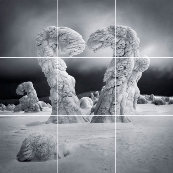
Rule of Thirds Composition
The greater tonal separation brought the two central trees into greater prominence through the resultant contrast differential between them and also added visual depth to the image overall. It brings more clarity and focus to the central figures, being the main subject of the image.
Vignetting was used in a very controlled and considered manner, brushing it in manually in targeted areas in a very organic style. The darker areas in the foreground and top of the image in particular, provide a visual containment for the image, preventing the eye from leaving the frame and adding further emphasis and direction to engaging with the hero features at the centre.
The stronger vignetting and darker horizon band add strength and depth to the atmosphere, emotion and mood of the image, infusing a very somber feeling throughout the frame.
Clarity, Sharpness and Noise
Increasing clarity and sharpness in the structural ice forms on the trees worked to intensify the physicality of the environment and enhance the dimensionality of all the features throughout the image. It was important to remove as much noise as possible before applying this sharpening to allow for the greatest potential impact of the clarity that was applied. Relative to the original image, the noise has been almost completely smoothed out, and in combination with the increased luminance, the image comes across with an almost hyper-realistic quality that really draws
you in to the frame.
This visual clarity provides extra space and separation between all the features relative to the original image. It gives the viewer more room to breathe and provides a greater distinction and dimensionality to the elements in the frame. The added sense of texture also gives it a more visual presence, like you can almost feel what they would be like to touch.
Colour
The image is essentially monochromatic. Even though it is still a colour image, there really is only one main hue. Its dark, cool tonality matches and accentuates the somber emotion pervading through the image. It also assists to portray the extreme temperatures and challenge of being in this type of environment.
Mirroring
There is a certain level of mirroring amongst the trees throughout the image. The shapes of the trees in the gap in the middle and also to the left of the frame have a close semblance to
the two central hero trees. This adds a sense of continuity through the image, a subtle tying together and a visual echo of the main structure, repeating almost like a soft sound reverberating
through the visual space. By drawing a slight amount of additional interest to the surrounding complementary features, the loudness of the central hero’s is slightly quietened and we are encouraged to explore the rest of the image a little more – giving a more balanced feeling overall.
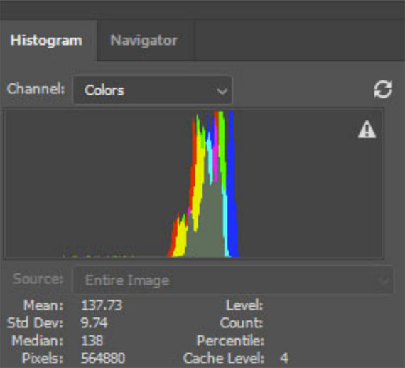
Histogram of the raw file.
“One can never discount the importance of ideas in photography. While technique and composition are incredibly important, it is the idea – the symbolism – behind this image that make it an award winner.” – Peter Eastway
Narrative
The image has been essentially reshaped and refined to augment the relationship and symbolism between the two trees. The shift in shape and dimension overall, gives the centre stage more clearly to the central figures. The extra foreground is the short pause while the curtains are opening, and the main act is the dynamism and connection between the two trees.
By resizing them to almost identical size and mass, a sense of equality is being conveyed between them. This is further emphasized by the new symmetry in shape that is realized through the reshaping.
Their positioning has changed also in that they are almost physically touching. This ties in the symbolism of the heart from the shape of the two together with much greater clarity and strength.
You can almost feel the angst of them not quite being able to touch, like that true connection is so close, but also just out of reach. A crack in the heart, that may or may not be able to be mended… or two beings reaching out for each other for love, and not quite being able to unite in wholeness.
The next largest tree off to the left almost feels like it’s looking on and acting as a quiet witness to the aching intensity between the hero figures, and waiting patiently for the outcome.
Reflections
• It’s rare that an image has influenced me as much emotionally as the creation of this one. And even rarer that I have managed to express myself visually to the degree of what I was feeling. I was concerned that perhaps I was too ‘inside’ the emotional context to be able to judge how others would see into it themselves, but the feedback has been amazing. Not everyone interprets the image exactly as I do, but it has moved many, many people in numerous ways which has been very special for me.
• As we all view the world through the filter of our own memories and experiences, you don’t always have complete control over how a viewer responds to your imagery. Art is, and always will be, a very individual experience. It can be very satisfying however when you create an image that reaches out and touches people enough to evoke a significant emotional response, regardless of what that response is.
• In my case, the process of creating this image was about taking a personal journey inside myself. It was about asking questions – and looking for resolution. As Wynn Bullock put it, “When I photograph, what I’m really doing is seeking answers to things.” And in this particular instance, I don’t know if I answered them, but I certainly took a few important steps closer…
• The experiences you have that impact you and stir you emotionally become a part of you, your uniqueness and subsequently, your vision. This image is about such a vision. Vision for me is everything. It gives you somewhere to aim for and a channel to travel through to develop your image-making expression and style. Emotion can be a fuel to drive such a process and help you achieve your goals. Your vision and style will come together alongside the development of your camera craft and postproduction skills. In summary, it’s a lifetime journey to develop a style and the skills to deliver what you truly wish to express, and emotion can be the fuel to drive it.
• It is my hope to put more and more soul and emotion into my imagery as I keep evolving as an image-maker and photography has already helped me immensely to experience life more fully in a much richer way…
For Further Training on Composition:
In this 182-page eBook, photographer Ignacio Palacios shares his expertise and insights on the art of composition in photography. The book is designed for photographers of all skill levels and is packed with original photos and illustrations to help readers understand and apply the concepts and techniques covered.
He takes the reader on a journey through each ingredient, revealing the insight, skills, and techniques he has used to create award-winning images and build a career as a professional photographer.
Found here: The 10 Ingredients of Composition Mastery
Like This Article?
Don't Miss The Next One!
Join over 100,000 photographers of all experience levels who receive our free photography tips and articles to stay current:
