In photography almost always, less is more. The fewer elements in a photo the clearer the story and the more impact your photo will have.
Song writers tell powerful emotive stories with very few words, imagine if they were rambling on “and then this happened and then that and blah blah blah…………” They use as few words as possible to tell the story, yet how often do we feel the emotion of the lyrics.
It’s the same with landscape photography; we should only include the elements that directly help to tell the story we are trying to communicate.

A good practice is, once you have framed up your composition, take a look at each element within the frame and ask yourself is this directly helping to tell the story that I am trying to tell or is it a distraction from the story? If it’s a distraction, reconsider your framing to try and exclude all distractions.
If you can’t frame it out in camera consider removing it in Photoshop.
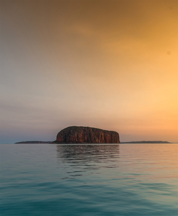
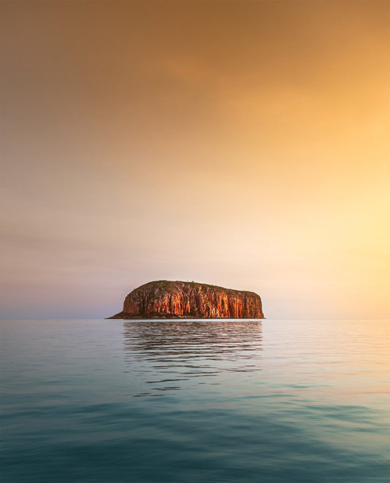
I have used Photoshop in the example below to remove the land mass in the distance, simplifying the image and in my opinion making a stronger photo.
The Island had a real feel of isolation, by removing the distant land mass, the story of isolation is much clearer.
Like This Article?
Don't Miss The Next One!
Join over 100,000 photographers of all experience levels who receive our free photography tips and articles to stay current:


Yes, the rock is more isolated. But then this is not a photograph that portrays the landscape in front of the photographer. Of course, as everyone says, “you can do whatever you want to.” Shouldn’t there be some implicit rules that insure that if you stood where the photographer was standing you would see the landscape that he photographed? If not, imagine what you could do–stretch the Eiffel Tower, enlarge the famous Arch in Utah, remove a mountain that you thought was a distraction, add zebras to a shot of the Sonoran desert–where does it stop?