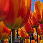
Mastering color is an essential ability to any good photographer. To achieve proficiency, a basic knowledge of primary colors and complementary colors is required. We will define these fundamental concepts and teach how to exploit them in order to take better photographs.

Each primary color also has a “complementary color“. The complementary color of a given primary color is defined as the color that added to the primary color gives the white light. It can be shown (but we will omit the demonstration) that the complementary colors for red, green and blue are cyan, magenta and yellow, respectively. What a photographer must always keep in mind are simply the (fundamental, complementary) color pairs:
(red, cyan)
(green, magenta)
(blue, yellow)

Similar colors are harmonious and not complementary. When just harmonious colors are present in a picture, color is typically not the main attraction. Other fundamental elements take over, such as form and texture. An example might be green grass against a blue sky. Let me give you a tip: if you are going to take a shot of a green grass, back lighting will produce a fantastic effect, making the green very vivid and glowing. So, keep in mind that direction of sunlight is important, too. Be careful when making compositions with similar colors in black & white photography. Most of the time, what appears clear and well defined in the colored world, will seem confused and lackluster in black and white.
Now you know how to compose a highly contrasting image or, on the contrary, a harmonious picture. All of this from a chromatic point of view. Now it is time for the better thing you can do: experiment what you have just learnt.
More articles about photography at ilghila.com
Like This Article?
Don't Miss The Next One!
Join over 100,000 photographers of all experience levels who receive our free photography tips and articles to stay current:


Leave a Reply