Ever wondered how some of the stellar fantasy art is done or wished you could convincingly add or replace something in an image? The secret is in producing photo composites, but creating a believable sense of depth often seems easier said than done. Luckily, the solutions aren’t as tricky as they may seem. For starters, check out this video by the Aaron Nace. He shows us how to add fish to an image of a girl in water:
Nace demonstrates how to use the free transform tool to quickly resize, customize, and position the fish in the image. He then uses the Field Blur filter from the blur gallery to customize exactly where and how much blur each fish will have—the more blur, the deeper it will seem. (Please note that field blur and blur gallery are only available in CS6 and CC.) Afterward, he uses saturation and blending modes to colorize the fish to match the water.
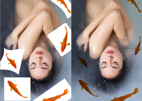
Remove the white background by changing the blending option to Screen.
Another trick to giving the fish more depth is to add water effects above them. In this case, Nace copies, pastes, and blends the bubbles and light refractions already found in the image on top of the fish to heighten the illusion that the fish are under the surface.
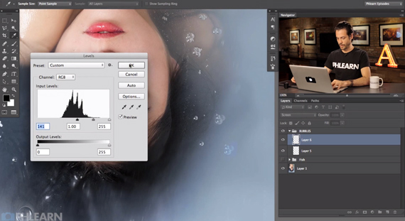
Adjust the levels to better blend in new bubbles.
Another thing Nace adds are various shadings and imperfections to make the fish seem that much more real. Whenever you’re making a composite, “It really helps out to add layers that add a level of variability to your image.” The lack of perfection helps to make things look real.
In the end, Nace shows that depth and layers will make (or break) a photo composite.
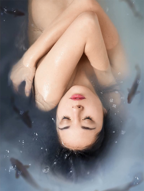
Final Composited Image
“Every little trick you can do to make things look like they’re further inside of a photo, those things will really help your composite to look believable.”
Do you know any other tricks to adding depth to elements of a composite? Let us know!
Like This Article?
Don't Miss The Next One!
Join over 100,000 photographers of all experience levels who receive our free photography tips and articles to stay current:





Leave a Reply