Much of the feel and impact of color images comes from how color is managed. In movies this is called color grading, but it can also be done with images. In video below, photographer Ted Forbes gives a fantastic tutorial on how to copy color effects from one image to another:

Color grading, used primarily in the world of video and motion pictures, has been gaining a lot of traction in the still photography world. At its essence, color grading is the art of manipulating the color of an image to bring out a specific look or feel. Done well, it can really change how we feel about an image.
For many, the actual art of color grading can seem elusive. Where do you start? That’s why this tutorial by Forbes is so refreshing; he breaks it down into simple terms of working with highlights, midtones, and shadows. Of course, we’re only discovering how to transfer a color graded look from one image to another here, but the principle pretty much holds true across the board.
Eyeball Method
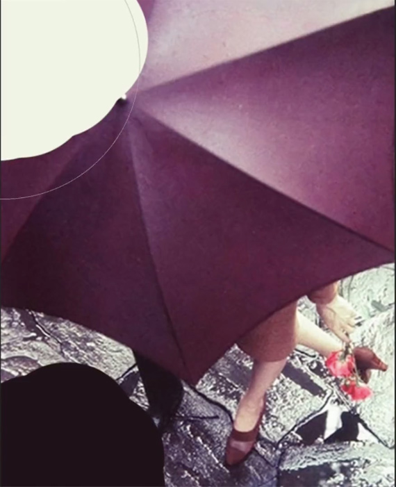
Forbes starts with an eyeball method, then goes on to a more exact, mathematical method. In both examples, he uses Photoshop, but the concepts will work in any advanced photography application. He starts by using the Color Picker to find out just what colors the shadows, highlights, and midtones really are. Dark parts of the image might look black, but in color images, they’ll probably have a color tint or shade to them. In the image below, the shadows have a clear magenta cast. (By clicking on the darkest part of the image with the color picker, you can see exactly what shade the shadows are.)
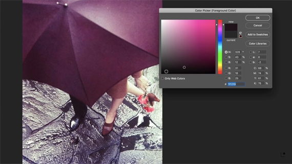
Matching the Shadows
Here, the highlights on the subject’s leg are being sampled. They come out with a warmer cream tone, sometimes leaning toward green. Generally, there will be some kind of split toning, with a warm tone at one end and a cool tone at the other. (Magenta can go either way. Against a warm tone, it becomes cool; against a cool tone it becomes warm.)
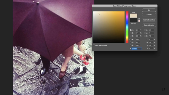
Matching the highlights
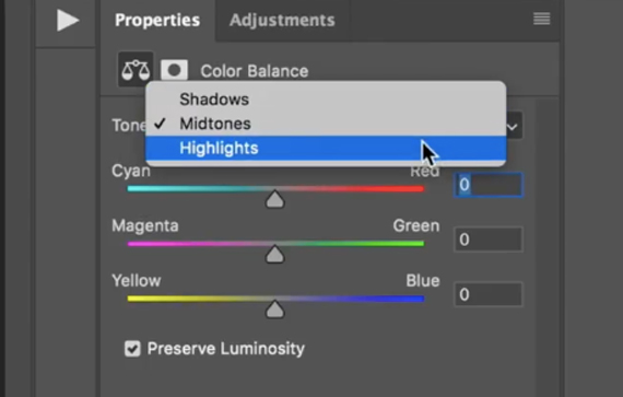
Once you’ve discovered the tints in the original image, simply adjust the color balance of the target image accordingly. The Color Balance tool in Photoshop allows you to adjust the shadows, midtones, and highlights separately.
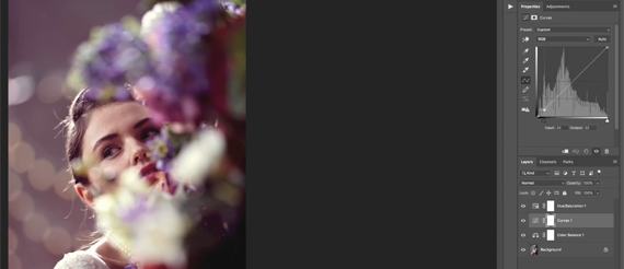
Next, add a curves layer and a hue/saturation layer. If you’re recreating a vintage look, you’ll probably want to bring the saturation down some, as modern digital cameras tend to create images that are quite saturated. You’ll want to bring the shadows up and over a little bit in the curves adjustment.
Swatch Method
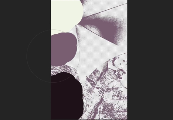
For the second method, Forbes creates swatches of color that he paints onto the image to sample later. The shadows and highlights are pretty easy to capture. Select the Brush tool and hold down the Option/Alt key to get a sample of the shadows and highlights of the image. Below you can see the two samples taken from the pant leg and the skin of the lady’s leg.
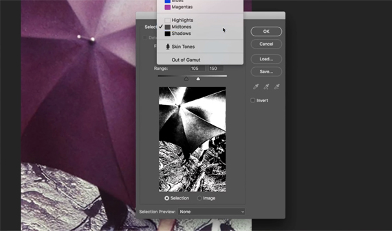
The midtones are a bit trickier. Forbes goes to the Color Range option under the Select menu and selects midtones. He then hits Command-J to create a new layer with this selection.
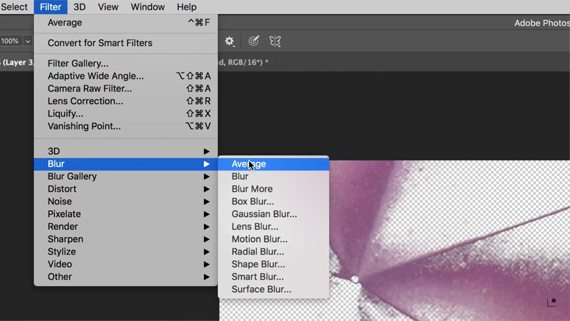
He then uses the blur filter (set to average) to choose a single color.
Once you have the midtone color, you can paint it onto the image:
When you have the three swatches, it’s time to map the swatches to the white point, midpoint, and black point.
Select the background layer and then make a curves adjustment layer. Make sure you select the curves and not the curves mask before making any adjustments.
Choose the appropriate eyedropper and then select a darker part of the image (for the shadows), a lighter non-reflection part (for the highlights), and a neutral midtown point. (Note: the eyedroppers in the curves adjustment are reversed; the top one is the black point, the middle one is the midpoint, and the bottom one is the white point.)
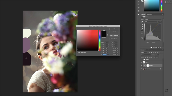
Using the black point eyedropper to adjust the shadows.
You might need to try a few different points before you get the perfect fit, but it’ll come.
Once you get the colors just right, you might want to soften the image a bit. Digital images tend to be much sharper than film images. Speaking of film, if you’re really going for a vintage look, consider adding in film grain and maybe a little texture. Some of the magic in those older images was that they were never quite perfect. That’s what made them so appealing.
Using either one of these two methods should allow you to easily recreate the color grading of any image out there. Like the look and feel of a movie? Take a still shot and apply one of these two methods. If you find one you like you can even make a preset out of it.
I’m definitely going to try it out!
Like This Article?
Don't Miss The Next One!
Join over 100,000 photographers of all experience levels who receive our free photography tips and articles to stay current:


Leave a Reply