Flat lay photographs work great for print and digital ads and even for thumbnails. In this video, photographer and filmmaker Peter McKinnon shares some of his tips on taking great-looking flat lay photographs:
1. Layout
“When you’re laying these things out for the photo, you kind of want to pick what the focal point is.”
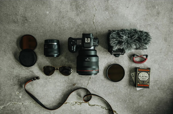
This idea is simple, yet many photographers fail to implement it. If you’re featuring a particular product, don’t use other items that are more flattering than the main product itself. There should be no competition for attention when you lay out the items. And in case you plan to have all the main subjects laid out on the surface, plan carefully on how you want to place them. The key is to have some level of organization and symmetry.
“You’re gonna line everything up but you wanna make sure that everything’s lined up in different directions to create intrigue, to tell the story, to lead someone’s eye from left to right or up to down.”
Invest your time in visualizing the scene when laying things out. Don’t just throw everything into the frame. Have an intention for every other thing that you decide to place in the frame. Like McKinnon demonstrates, you can use your hands to visualize your frame, and don’t forget to have a bird’s eye view of the scene. Make sure that the viewers first land their eyes on the focal subject and then go with your flow.
2. Balance
Like in any other genre of photography, balance is important in flat lay photography. Arrange the elements of your photo so there’s balance. For instance, if some of the products are big and others are small, arrange them so that they intertwine with each other.
“You want to fulfill that visual satisfaction and you get that when you focus on the details.”
Creating a visual balance doesn’t mean having symmetrical layouts. If you feel that there are gaps in your images, you can use supporting elements that complement the main subject.
3. Texture
“Typically, a flat texture-less surface is not going to complement whatever it is that you’re shooting as a flat lay.”
Think of smooth surfaces as being lifeless. For your background, choose materials that have some kind of physical texture or complementing patterns. Texture adds detail and life to your image.
And you don’t always need to use smooth surfaces for your background either. In the following image, McKinnon used his shirt as the background to complement the knife’s handle.
“The texture almost becomes an item in itself in the photo.”
If you’re looking forward to shooting flat lays, begin with your hobby. Take the items and accessories associated with the particular hobby, lay them out on a flat surface, and take a photo. Keep in mind the above three tips, and try to make a story out of your image.
Like This Article?
Don't Miss The Next One!
Join over 100,000 photographers of all experience levels who receive our free photography tips and articles to stay current:










Thanks for this new topic
Thanks for the good ideas.
A cultural suggestion: Chopsticks stuck vertically in rice is only done when someone has died.