Rules? Really? I know what you’re thinking… you don’t like rules. Well guess what? Neither do I. In the words of Pirates of the Caribbean‘s Barbossa, they’re more what you’d call “guidelines” than actual rules.
This is part one of a series of articles I’ll be writing to make you a better photographer. If you like them—or even if you don’t—let me know using the comments below.
Now it doesn’t matter what type of camera you’ve got, whether it’s a simple point-and-shoot, or the latest Nikon with a top-of-the-range lens; you’ll become a better photographer by following these guidelines.
Guideline 1: The Rule of Thirds
Simply put, the rule of thirds helps you get maximum impact in your photos by making sure you fill the image with interesting things. It consists of a 3×3 grid, and the aim is to put your subjects at the intersections of the grid lines and try to really fill the frame.
Now I’m not saying there absolutely has to be something going on in every single part of the grid but as a general rule it will make your photos better.

Photo by Justin Kern; ISO 50, f/8.0, .5-second exposure.
A simple technique I use is to get a photo I’ve taken and overlay it with a 3×3 grid. I then count how much of the grid I’ve filled up.
Guideline 2: Balancing
Balancing can be used alongside the Rule of Thirds to produce photos that are just that little bit different. We’re all used to taking photos where we try to get the focus in the center of the image. The balancing technique puts this focus somewhere else, and at the same type adds some other interesting elements to the image.

Photo by Hans Splinter; ISO 200, f/5.6, 1/400-second exposure.
Guideline 3: Viewpoints & Angles
You might have heard the quote “fail to plan, plan to fail.” It’s normally used in business to demonstrate the importance of planning.
Take a car manufacturer. It doesn’t just build cars—a lot of design, development, and testing go on in the background before it even gets to the production line. Those same principles apply to photography.

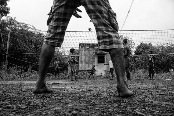
Photo by Karthik Pasupathy Ramachandran; ISO 400, f/5.6, 1/320-second exposure.
Before taking your shot, take a quick look around. Think about your audience and how they’ll see the photo. Do you want a shot taken at eye-level, down below, from the left or right, or from an elevated viewpoint? Each angle or viewpoint will give the audience a completely different perspective of the photo.
Guideline 4: Backgrounds
Backgrounds can make or break a photo. You can have the most amazing focal point, but something distracting in the background can cause the whole photo to fail. I’ve seen many a photo fail because of an exit sign or other distracting element in the background.

Photo by Bailey Cheng; f/8.0, 1/250-second exposure.
If you can move around, do it. If you can get your subject to move, even better. Some people prefer to Photoshop the bad bits out later. My advice to you is concentrate on getting the perfect photo the first time every time. I can guarantee you’ll become a better photographer for it. Only if you’ve tried your best and it’s impossible because of something outside your control should you turn to Photoshop.
Guideline 5: Depth
What is depth? It’s a way to make photos look more real—to make them stand out a bit. Our eyes can make out objects at different distances quite easily, but in photos it can be quite challenging.

Photo by Dallas Hayward; ISO 80, f/3.2, 1/180-second exposure.
The trick is to take a photo that has objects or elements at different distances and make people believe what you saw when you took the photo.
Guideline 6: Framing
Framing lets you to take a photo where you have so much going on but the focus is on just one or two areas of the photo.

Photo by Phil Norton; ISO 100, f/7.1, 1/80-second exposure.
Final words (for this article at least): don’t be afraid to experiment
In the age of digital photography you can click away without thinking about huge photo developing costs. Compare photos taken at different angles, with different depths and different backgrounds to become the best photographer that you can be.
Happy snapping!
About the Author:
Mo Azam is a professional photographer (iamfoto dot co dot uk) based in the UK.
Like This Article?
Don't Miss The Next One!
Join over 100,000 photographers of all experience levels who receive our free photography tips and articles to stay current:


Great tips. All of these same ‘rules’ cross over into the fine art world too. I teach the rule of thirds on my blog and also use the Golden Rule or Golden Ration as a compositional tool too.
Thanks!
Lori
One more thing. Many DSLRs have grid overlays that can be turned on in the view finder. This may also be true of some Point and Shoots. While my Canon XSi did not have this feature, my 7D does have it and it is really useful sometimes to turn it on and compose in camera rather than using the grid to crop later in post production. I also have grid layers that I can add to an image in post and then delete before exporting to JPG. I use GIMP but any post production software with the ability to use layers can be done this way.
By the way the image above that is in the Rule of Thirds part of the article (“Sognsvann” captured by Rino is not using the rule of thirds fully. While the girl is on the one third line left to right, the image is divided 50/50 top to bottom for symmetry. The reflection being a mirror of the top of the image. This is a good example of combining symmetry with Rule of Thirds to maximize impact, but is a poor example of the basic concept of the rule of thirds in practice.
Instead, Mark, if you look carefully you realize that the laid tree plus their reflect, plus the background mountains and both their reflects; the whole three elements fills the middle third from bottom to up.. the center third tall. Think about it. THanks
Sorry, but I don’t understand your explanation of the Rule of Thirds. It is nothing like what I have read everywhere else. Basically the way I understand it is that you use a grid that is three wide by three tall(evenly spaced in height and width) and you attempt to put your main item of interest on one of the four intersection points of the grid. This is often expanded to a similar concept called the Golden Mean which the same process but using a grid that is approximately forty percent in from each edge. This gives the same nine sections but they are not all the same size. The main purpose of both of these rules is to avoid placing your subject in the center of the photo which means that this is often totally thrown out when you want the image to have symmetry. The Golden Mean rule can use a grid or a spiral that when using the spiral you try to place multiple focus items on the line of the spiral. This is often good when you have a busy image with lots of points of interest as it brings order to the chaos. Even then they may not land perfectly on the spiral, but if they are generally close to the spiral it helps the image be less chaotic.
Love this article! Definitely helpful.. Could u explain more on the rule of thirds? Filling up as much of the frames as possible with the key subject or?
could we add layers?