It doesn’t matter how technically perfect your images are if they’re not composed well. Photographer Tom Mackie shares seven composition tips for landscape photography and explores a wide range of photography composition rules in this video:
1. Leading Lines
“Leading lines is probably one of the major parts of creating or designing a composition.”
In composition, leading lines are used to drive the viewer’s eye through the entire frame. While some leading lines are quite obvious, others can be subtle.
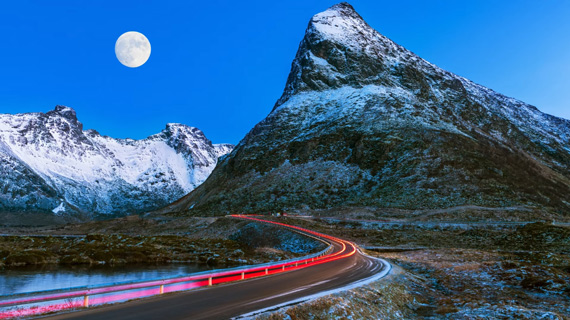
If need be, you can even create your own leading line to pull viewers right into the subject of your image. For instance, Mackie used car tail lights to create a leading line in the image below using a 30 second exposure:
2. Rule of Thirds
The rule of thirds is another basic “rule” that can be used to create highly effective compositions. By placing your subjects on the rule of thirds lines and intersecting points, you can immediately draw attention to them.
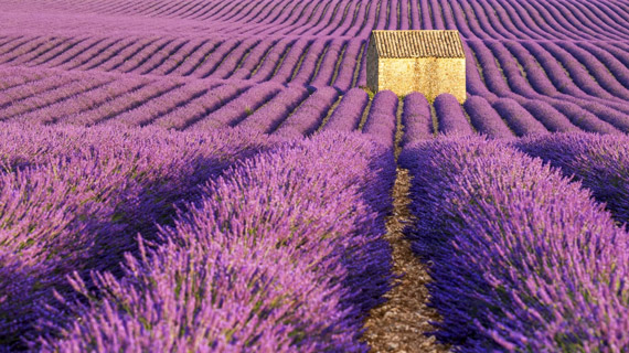
See how Mackie uses the rule of thirds, leading lines, and shallow depth of field to draw attention to the barn:
3. Framing
Keep your eye out for natural elements you can use to frame your subjects. Trees, branches, and bushes can work well to frame and isolate your subject and draw attention.
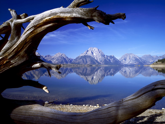
The image will appear more balanced and flattering if you pay attention to symmetry when using natural frames. For instance, in the following image, it was crucial that the peak be symmetrically between the two branches:
4. Symmetry
“Symmetry is great when you’re using this in a composition because it just adds so much dynamic impact to the image.”
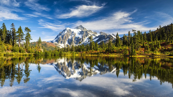
To achieve symmetry in your composition, distribute the elements in your frame in an identical fashion in any two directions. Including a reflection is a great way to add a sense of symmetry.
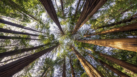
5. Try a Different Perspective
People tend to photograph from their own height.
“I tend to take the camera off the tripod. I walk around and look up, and I look down. I get down on my belly and I look around.”
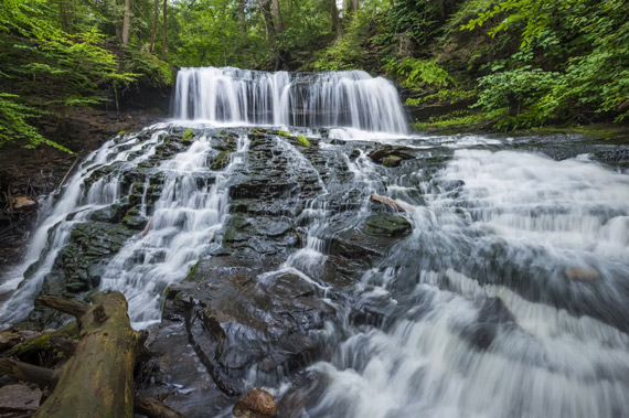
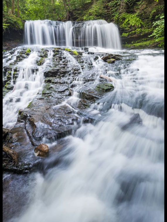
6. Try Different Orientations
Some images look great in landscape orientation. They might look even better in portrait orientation. Be sure to try out both orientations so you can choose the better one later rather than regretting the missed opportunity.
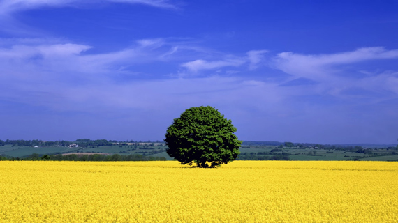
7. Graphic Shapes
Graphic shapes allow you to create a more dynamic image. Learn to see your composition in the form of shapes and choose the best combination for an effective image.
The image below has a blue rectangle (sky) in its upper two-thirds and a yellow rectangle (field) on the lower third. The tree in the middle acts as a round shape in between the two rectangles.
Remember to give some of these composition tips a try the next time you’re out taking photos!
Like This Article?
Don't Miss The Next One!
Join over 100,000 photographers of all experience levels who receive our free photography tips and articles to stay current:






Leave a Reply