Did you know that where you place the horizon within your photos can have a dramatic effect on the feeling of your images?
Of course, it’s our job as photographers to take photos. However, it goes deeper than that—it is also our job tell interesting stories with each photo we capture.
What do I mean?
We are telling stories with our images, stories about the interesting things we see. If we snap away without any thought to the story, then we are likely missing an opportunity to create a stronger photo by telling a more relevant story.
Horizon placement can help us tell more compelling, interesting stories.
Let’s look at three examples: three different compositions of an iconic Australian location, Uluru in the Red Centre.
In the first example, we have roughly two-thirds foreground to one-third sky. This composition tends to accentuate depth in our photos, as the viewer can take the journey from the close details in the foreground all the way back to the main subject, Uluru.

Notice the sense of depth when compared to the other versions. Almost inviting us to walk into the frame.
In the second example, the ratios are reversed: we now have roughly two-thirds sky to one-third foreground. With more sky, this composition tends to communicate a sense of open space, while still allowing our viewer to journey from front to back.
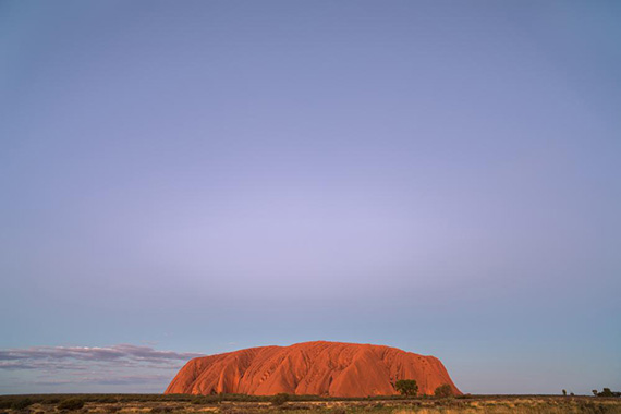
Finally, if we go for a contemporary composition with mostly sky and almost no foreground, this composition really emphasises the wide open spaces of the Australian outback.
I really wanted to communicate the sense of space and the dominance that Uluru holds on the landscape, and for that reason I chose the composition below as my favourite.
What do you think?
Of course, it’s up to us, the storytellers, to decide which composition best suits the story we are trying to tell.
Like This Article?
Don't Miss The Next One!
Join over 100,000 photographers of all experience levels who receive our free photography tips and articles to stay current:


Never been a fan of “rules” in my life ;) So I agree with Bob, yet disagree at the same time. While I also typically utilize the 1/3 top or bottom horizon lines, occasionally rules are meant to be broken. When photographing something like reflections for example, where you want the sky to match the bottom equally, I sometimes find it virtually impossible not to place my horizon dead center. It can be polarizing to the eye but in a good way IMHO. Of course you can avoid this if you use a wide enough angle to provide you more play room with the rule of 1/3’s, but you may sacrifice interesting detail. All depends on the scene and what you story you are trying to convey when breaking rules…and so I agree with Adam that the more modern 3rd option of Uluru, with the dramatic use of negative space, is also my favorite. And breaks “technical” photography rules.
And be sure to keep those horizons LEVEL, not “tipped” in one direction or the other. So simple to do in post, yet so many landscape photos have the horizon running right through the middle of the shot, dividing it into two equal parts with the horizon tipping toward one direction or the other. Drives me CRAZY!!! I generally prefer the horizon up 1/3 from the bottom, or at the very least down 1/3 from the top, but NEVER right through the middle of the scene. Where is the viewer supposed to look? What is the main portion of the photo, top or bottom? Geesh…..