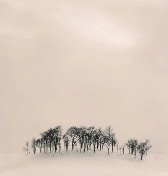
Simplification and negative space are two terms that are closely related. You can’t talk about one and ignore the other. But what exactly is simplification? And how do you explain negative space? Ted Forbes shares his take on the subject:
Simplification
Simplification denotes reducing the elements in your composition down to a bare minimum—just what is necessary to create the composition. That entails removing unnecessary elements. In a way that is also minimalism. But simplification and minimalism are technically not the same thing. Simplification is specifically about removing unnecessary elements.

Michael Kenna
Simplification is technically harder to achieve in photography—especially in outdoor photography—because it entails eliminating elements that are already there.
Negative Space
Negative space refers to the empty space around your subject. Consider it “breathing space.”

Michael Kenna
Just like with simplification, you don’t want extraneous elements around the subject, because that again attracts attention. But you can use elements like the sky or the ground to emphasize the subject.
As photographers, we spend a lot of time deciding what to put into a composition. But next time you’re out taking photos, dedicate some time to considering what should be left out of the frame.
Like This Article?
Don't Miss The Next One!
Join over 100,000 photographers of all experience levels who receive our free photography tips and articles to stay current:


This is a technique and approach to photography that I have not thought much about before today – I like what I see and hear. Thank you for this – I can only just bring myself to ask this question for it may bring your wrath upon me : is it permissible to remove distracting elements in a photo to enhance simplification and negative space in a photo.