If you’ve never edited an image before, you may be wondering why you should bother, and if you’re used to editing being part of your workflow you may be wondering what Luminar can do to enhance your images that other image editors can’t.
For those who are wondering why you should bother with editing, the reasons are simple. Post-processing your images is like putting the final touches on your masterpiece! It lets you adjust exposure, color, contrast, and much, much more. You don’t have to get into the realm of fantasy composites to do a good, basic edit on your images, and it will make all the difference to the final image.
Luminar is a fast, powerful image editor that will grow with you as your skills progress, and it offers the power of artificial intelligence to help speed your editing workflow along.
Today, we’re going to look at ways to make your images stand out by using manual adjustments, filters, layers, LUTs, and presets.
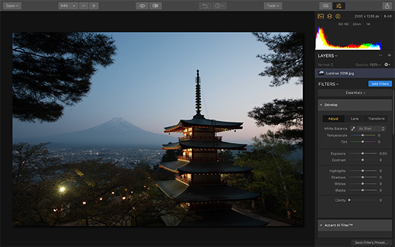
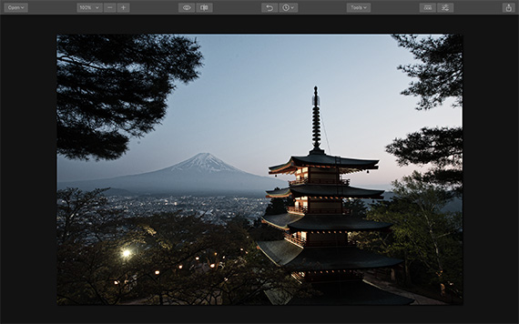
This is our starting image—a good travel shot, but it could do with some tweaking to really bring out the best in it.
There are several routes you can take to enhance this image in Luminar, so let’s have a look at some manual adjustments first.
Develop Panel
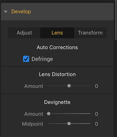
On the right-hand side of the screen you will see the Develop panel, with the basic tools such as exposure, contrast, highlights, shadows, etc. These basic tools will serve as a starting point for the edit, but before I do that, let’s look at the Lens tab. Clicking this tab will enable us to correct any lens distortion. This is what the panel looks like:
By moving the sliders, you can correct both distortion and remove any unwanted vignetting (dark areas around the outside of your image) that’s been caused by your lens.
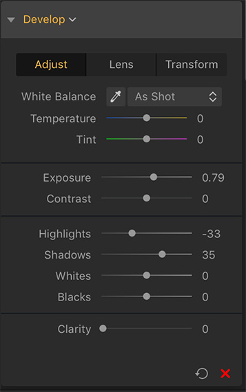
I adjusted the exposure, shadows and highlights a bit in order to make the image a little lighter but without making the highlights brighter.
The image still has quite a lot of dark areas in it, so we will turn on the Shadow Clipping warning at the top left hand side of the histogram. This warning is a little triangle which turns orange when activated. There is one on the right hand side of the histogram too, for the Highlight Clipping warning.
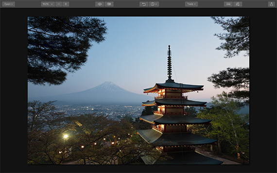
Once activated, these handy warnings tell us when there is no detail left in certain areas of the image, and that these areas have gone dark black or bright white. With shadows, it will show up as a blue color on your image, with highlights it will turn burned-out areas red. This is the shadow clipping on this image:
As you can see, there is still a bit of blue color in the tree branches on the left-hand side of the frame, but it’s not much at all. I’m happy with that, as I don’t want to go too far in lightening the shadows.
LUT Mapping
LUT stands for Look Up Tables, which are mathematical formulas that can be applied to an image to give it a certain look or feel. The most common in recent years has been the ‘cinematic’ look, so that your images look like a still shot from a movie. LUTs have been used by the film and video industry for years, and now photographers are seeing the benefits of using them to color grade and tone their images in one quick step.
You will find the LUT Mapping panel in the Filters menu under the Professional tab. LUTs are meant to be applied after you have done all your basic editing, such as exposure, white balance, etc. Bear in mind that they are not a quick fix for mistakes in your image, such as being over/underexposed. They work best when you start with a properly exposed and corrected image.
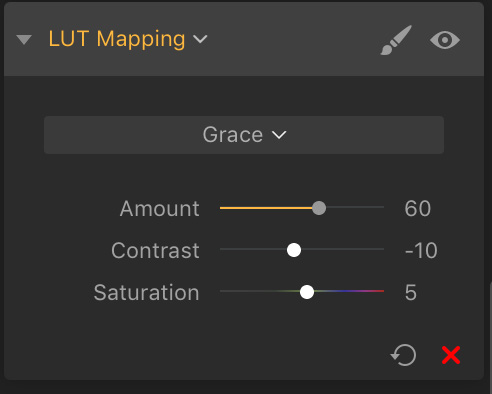
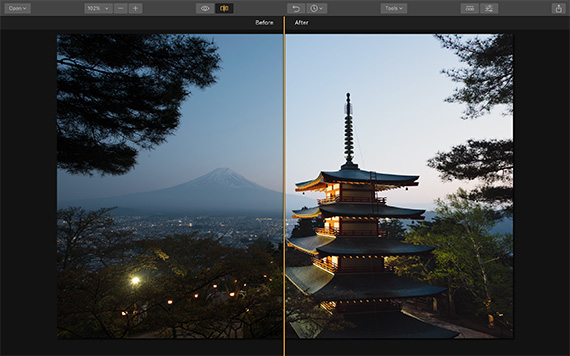
Luminar 2018 has a wide choice of LUTs, and I have applied the LUT called ‘Grace’. I reduced the amount to 60 percent and dropped the contrast, as it was too strong at the default levels. I also boosted the saturation a little, too.
Here is the before/after split after applying the LUT:
LUTs can really make your image stand out, and save you a lot of time doing so.
Accent AI Filter
If you are pushed for time, or if you are totally new to editing images and don’t know where to start, the Accent AI filter is a great tool. It uses the power of artificial intelligence to examine the data in your image and make tailored adjustments to it automatically. It can fix a lot of the issues found in images straight from the camera, and you still get to control how much of a change it makes by using the Boost slider to adjust the amount.
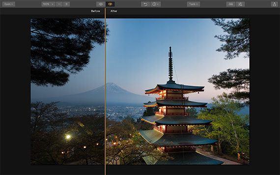
This before/after split is of the original image and the Accent AI version:
It has automatically adjusted the shadows, contrast and colors for me, giving a richer and better-rounded image.
Presets and Adjustment Layers
Luminar comes with a wide variety of presets that you can apply to your image in a single click. These presets will work with all kinds of images, from landscapes to portraits, and you can find them by clicking this little icon along the top of the menu bar:
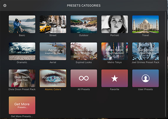
A film strip of presets will appear underneath your image, showing a preview of what it will look like with the preset applied. To find the preset categories, click on the Categories button, and this screen will appear:
Some categories are signature collections by photographers such as Joel Grimes and Brian Mattiash, and for this image we’re going to apply a preset by Joel Grimes:
This is his ‘Dramatic Detail’ preset, and it has really brought the detail in the image to life, especially in the snow-capped mountain and the cityscape.
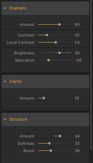
Presets allow you to choose the strength being applied to your image, and each one is fully adjustable. This is how I tweaked the preset in the develop module:
In this way, you get to use the preset as a starting point for your own adjustments, or you can leave it as is.
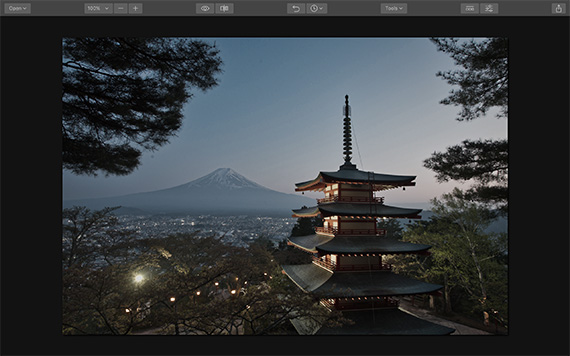
You can also combine two or more presets for dramatic results. This is done by clicking on the + icon near the Layers panel. This will give you an adjustment layer on top of the preset you’ve just applied. You then click on the preset you want to add to the first one, and you get to see the combined result. I have added the preset ‘Portrait Pop the Blues’ to the ‘Dramatic Detail’ preset in the image below:
Again, I used this as a starting point and made my own adjustments, such as boosting the vibrance and saturation.
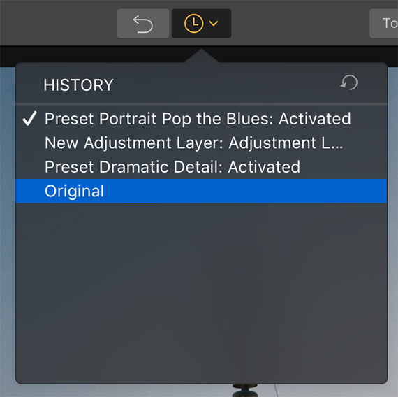
There are black and white presets if you want to create an eye-catching monochrome image. I took the photo back to its original state by using the History tool. If you were wondering how to go back to your original, unedited image, this is a way of doing it. You will find the History along the top menu bar. Click it and you will get a drop-down list of all the adjustments you have made to the image.
Right at the bottom the last item will be when you loaded the image originally. Click it and it will reset everything.
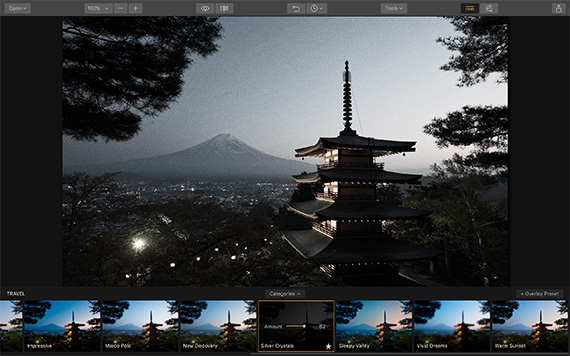
Once I reset the image, I applied this black and white preset ‘Silver Crystals’ from the Travel preset collection:
It makes for a fabulously grainy and atmospheric image.
Learn more: The Luminar 3 Photo Editor
Like This Article?
Don't Miss The Next One!
Join over 100,000 photographers of all experience levels who receive our free photography tips and articles to stay current:



Hello, Thanks for this great instruction, its fantastic.
But why not in a movie or in u youtube?
Regards, peter nadort
This is really useful, thank you!