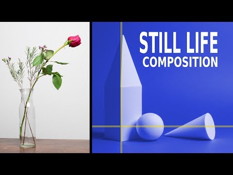
Technicalities aside, it’s composition that defines an image. Your viewers probably don’t care what settings or equipment you used, or how you took the image. They are more concerned about what they see, and what they see is composition. In still life photography, composition is even more important. Creating visually interesting photos out of everyday objects can be a challenge. Photographer Ed Verosky shares some useful tips for still life composition in this video:
Rule of Thirds
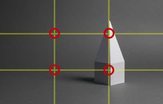
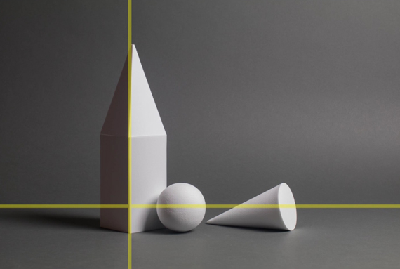
This is one of the most popular, easy to understand, and powerful composition guides used in visual art. According to the rule of thirds, you divide the frame into nine equal segments using two vertical and two horizontal lines. The points where the vertical and horizontal lines intersect are considered the focal points. Try placing important elements on these points. You can also align the horizon in your image with one of the horizontal lines on the grid instead of having it dead center.
This composition guide helps in shifting the balance of your composition to one side and allows the viewers’ eyes to move around your image. If you have a hard time visualizing the rule of thirds grid, see if your camera can overlay it for you.
Rule of Odds
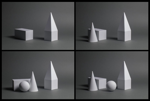
This composition technique suggests that an odd number of objects is interesting to look at compared to an even number of objects. Try to avoid making a composition that’s too symmetrical. Play with the visual balance—perhaps imbalance.
Leading Lines
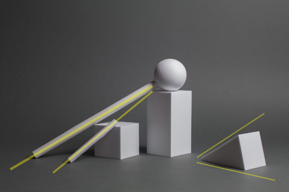
Leading lines work as guides to drive the viewers’ attention to one part of the image to another. While leading lines can be very powerful in landscapes and environmental portraits, they can get a little subtle when it comes to still life.
Groupings
Groupings help viewers determine the relationship between your subjects. How you choose to group objects in a frame can either create tension or harmony. The way you choose to group objects thus becomes a vital part of your composition.
L-Shape Structure
For still life photography, Verosky suggests that composing in L-shape can be the best choice, as it lets you compose along a horizontal plane. This concept is also in agreement with the rule of thirds.
“You start with your taller object on one of the vertical grid lines in one side of the image. And then you build up the rest of the supporting objects along the base.”
Other Composition and Design Elements
Besides these rules and guides, there are other factors you need to consider when setting up your composition. You need to have a holistic view of the tone and contrast, pattern and rhythm, color, and texture, among other factors. Pay attention to how the elements complement each other and work together.
Again, don’t be awestruck with all these rules. Take them as guidelines and use them as supports to improve your learning. There is no need to always stick by the rules. Try out your own style and use these rules as a reference.
Like This Article?
Don't Miss The Next One!
Join over 100,000 photographers of all experience levels who receive our free photography tips and articles to stay current:




Leave a Reply