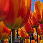
When doing photography in general, and in my case, travel photography, the use of a photography template can be very beneficial and help improve overall performance.
By photography template, I mean pre-defined, well-known and efficient photography composition templates that are recurrent and relevant in photography and fit popular “good taste.”
Knowing your usual and favorite photography templates will help you be faster and thus nail the shot when things happen very quickly, which is very often the case when photographing people.
So before I talk about the use of these templates and the positives they bring us as well as their dangers, let’s try to define those I personally use on a daily basis. I do not know if these templates have already been described in details elsewhere (I am writing this while on the road and haven’t had the time to do much research) but this is not the point. I’d like to show you the ones I use, as a travel/people photographer in Asia.
This is just a quick list I have made referring to my images from the last few weeks’ travels, as I am still on the road. This list is not comprehensive—just what I most commonly use.
Let’s start with the basics.
The Rule of Thirds with Clean Background
A very simple and efficient way to enhance our subject and give dynamism to our image. The rule of thirds for the dynamism (unlike the middle placement for more static moments) and a clean background so our eyes do not get lost in it and remain mostly on our subject. Your background can be simple such as plain wall, or because of a shallow depth of field. Ideally, find colors that work well together and are complementary between the subject and the background.
The Rule of Thirds with Balanced Background
If you’d like to tell a bit more of a story in your image, try and find a background that will balance your subject.Help the viewer’s eyes go back and forth between the subject and the background. It remains important to keep the background quite simple as too many details can be confusing. It’s also very important to keep in mind the weight of your image so one element doesn’t completely take over the other.
The Rule of Thirds with Busy Foreground
Inspired from photojournalism, a very useful template that will help you to add a feeling of business and action to the image. Having a busy foreground will make it feel more dynamic but can also help hide a messy background.
The Dynamic Diagonal
A very simple but efficient template that works very well when there is action. The diagonal line being much more dynamic than the straight line will increase the dynamic effect and give your viewers’ eyes a direction to follow through the image.
The Frame
No need to introduce this very popular composition technique also called a frame within a frame. A very efficient way to draw the viewers’ eyes onto a specific element of the image.
The Human Frame
A little more tricky here but still very efficient, mostly when using wide angle lenses. The idea is to use people as natural frames for your image and also create leading lines for better dynamism. It can also help get rid of messy backgrounds by hiding them with these frames.
The Rule of 10th
This time the idea is to create a feeling of emptiness into most of the picture for a more dramatic result. It works very well with silhouettes or with deep blue skies. Basically, the empty space of the picture adds drama.
The Triangle
Being the most simple shape, the triangle will help your viewers’ eyes follow the three main elements that are filling your frame. Please note that it is important to really fill your frame with your elements and not leave some useless empty space.
The Middle Placement
One of my favorites: placing your subject in the middle when there are symmetrical backgrounds gives a simple and very well balanced feel to your image. Its lack of dynamism makes it ideal for quiet and peaceful situations but personally, I like to break that peacefulness and predictability with a dynamic body gesture from my subject.
The “Look Into the Frame” Portrait
A kind of rule breaker but one which works a lot for me. Instead of having our subject looking into the rest of the image, he/she is captured looking towards the frame. That works very well as it creates opposing tensions through the image that pull the viewers’ eyes towards both sides of the image.
The Guillotine
The idea here is to remove our subject’s head from the composition to enhance other elements like their hands, feet, tools, etc… Human beings are automatically drawn to look in people’s eyes first . Removing the head (and thus the eyes) directs our attention to the rest of the image. Of course, you don’t have to remove the whole head, removing the eyes will also work.
While these few examples can help you to make faster decisions when things are happening quickly, they can also block your creativity.
Often on the tours, I am faced with advanced photographers who have been stagnating in their creativity for a while. They know all the camera settings and basic rules of composition but find it difficult to go beyond their usual images. When looking through their portfolio, the word that often comes to my mind is “predictable.” Image after image, I see the same templates happening. The photos are very nice, of course, but they lack originality because of the tyranny these templates impose in the end.
So a wise photographer uses templates in order to be faster and more effective in the field but adapts them with originality to particular situations or moments.
It is also very important to keep creating new templates that can be discarded any time we no longer fancy them. This will help the photographer to evolve and continue to be original.
So if you’d like to improve your photography, have a look at your portfolio: what templates do you see? Are these templates becoming redundant? Are they dominating your work?
And when you look at your favorite images, how are they different from the others? How did you manage to break your usual templates to come up with better, more original images?
About the Author:
I am Etienne Bossot, and I’m delighted to take you on an amazing journey through stunning locations in Southeast Asia, while sharing my passion for photography. For the past four years I have been teaching to thousands of people, having any kind of photographic levels. I am also a commercial and wedding photographer in Southeast Asia.
Like This Article?
Don't Miss The Next One!
Join over 100,000 photographers of all experience levels who receive our free photography tips and articles to stay current:


Interesting point a view. Well explained. Thank you for sharing
It’s a nice article, but I don’t agree. I personally never start a trip or a photo session with a composition preset or template in my mind. I much often do frame a little bit wider, so when I’m back home can manage any crop upon the mood I feel or I want to impose to my prints. This said, I dont suggest to shoot with super wide lenses anyhow, you can get wider frames with a 200mm aswell but… but make sure to have a safety exitway whatever happens. Sometimes I mimick the shooting setting my Nikon live view on “video” in order to get a 16:9 crop, and it comes expecially when I’ shooting in order to produce an AV footage.
Great article! Examples and when to use these templates are very helpful to the newbie!
Super! Fantastic!! Very, very interesting!! I did not all of them, thanks for them! but those I did know are also interesting to remember and telling them again!! How quickly a person forgets, don’t we? (I only speak for myself of course! ;-)
…perfect article, great examples, easy explenations!